5 Simple Rules for a Amazing Logo

Our handy little pocket guide to understanding what makes a logo amazing.
According to Wikipedia: A logo is a graphic mark, emblem, or symbol commonly used by commercial enterprises, organizations, and even individuals to aid and promote instant public recognition.
We’ll start with the rules of what a logo should be, and then apply them to famous logos to see them in action.
1. Simple
A logo should be simple! This one is so important, I think I’ll say it twice. A logo should be simple and not fussy looking. Leave off all the extra details and excess elements. Simplify it, walk away, then come back and simplify it again. The golden rule is that you should only have 1 focus. Remember, the goal isn’t to create a picture or painting, it’s to create a symbol.
2. Unique
A logo should be unique and memorable. It’s okay and even recommended to find a few logos that you like and incorporate their style or mood. It’s not okay to copy another logo. Besides for being unethical and maybe getting you into legal trouble, it undermines the entire point of promoting instant public recognition with the logo.
3. Scalable
A logo should be function-able at various sizes and on different mediums and locations. It should look correct on an app icon, in a magazine, embroidered on a shirt and on a billboard. Small details that are not absolutely necessary should be removed, as they will be lost in the small versions.
4. Colors
A logo should ideally have no more than 2 colors and be recognizable in black and white. There will be many times when you cannot show your logo in color. Whether imprinted on a pen, embossed on a leather portfolio or frosted on a glass, the logo needs to still be recognizable.
5. Fonts
A logo should have a maximum of 2 complimentary fonts. Many times the same font in different thicknesses or different sizes looks better than mixing in a second font.
Now let’s play a little game. I’ll say a company and you have 2 seconds to think of the logo. Let’s see how many you get right and how well the companies’ logos promote instant recognition.
- Target
- Nike
- Fedex
- Amazon
- Apple
- Coke
Below are the answers. How many did you get right?
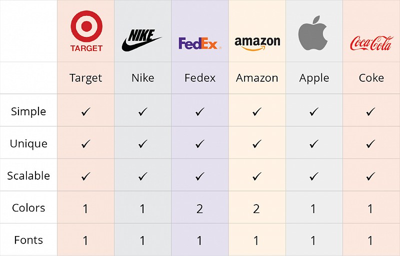
Now lets rate them according to our rules:

We got a 5 out of 5 for all the logos. Try ranking other popular logos of know companies against the rules and see how they do. I’ll bet that most will be 5 for 5 and the few that aren’t won’t score lower than a 4/5.
Next time you need a logo remember these 5 rules: Simple, unique, scalable, fonts and colors.
Want to stay in the know?
Sign up for our weekly newsletter full of Business Advice & Tips you don't want to miss!


